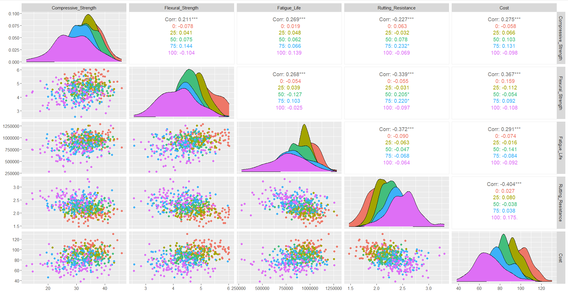
The strong positive correlation observed between compressive strength and flexural strength across both virgin and recycled asphalt mixtures highlights the potential for RAPs to meet structural performance requirements, albeit at slightly reduced levels compared to virgin materials. Meanwhile, some scatterplots showed variability in cost and performance, particularly for higher RAP percentages. Although RAP inclusion typically results in cost savings in real-world applications, the observed dataset trends might reflect localized production complexities or specific project conditions. Notably, the scatterplot distribution for 75% RAP indicated high variability in cost incurred, while the flexural strength was significantly lower than that of mixtures with 25% RAP, which were more reliable as a result.

Notably, the scatterplot distribution for 75% RAP indicated high variability in cost incurred, while the flexural strength was significantly lower than that of mixtures with 25% RAP, which were more reliable as a result. Additionally, a comparison of performance across 50% and 100% RAP revealed that even at higher RAP percentages, load-bearing capacity remained considerably high, particularly when balanced against the reduced material costs. This reinforces the practical advantages of RAP utilization, but it also highlights the potential for performance variability at higher percentages. The findings underscore the potential of RAPs to contribute to a circular economy within the construction sector.
# CIRCULAR ECONOMY TERM PROJECT
# RISK ASSESSMENT WITH RECYCLED ASHPHALT PAVEMENTS OR RAP

# Load necessary libraries
library(dplyr)
library(ggplot2)

# Load data
data <- read.csv("asphalt_properties.csv")
names(data) <- c("Type", "Property", "Mean", "StdDev")

# Define number of simulations and RAP percentages
num_simulations <- 100000
rap_percentages <- c(0, 25, 50, 75, 100)

# Function to get property values
get_property_values <- function(rap_percentage, property_name) {
  virgin_data <- data %>% filter(Type == "Virgin" & Property == property_name)
  rap_data <- data %>% filter(Type == "RAP" & Property == property_name)

  virgin_mean <- virgin_data$Mean
  virgin_stddev <- virgin_data$StdDev
  rap_mean <- rap_data$Mean
  rap_stddev <- rap_data$StdDev

  combined_mean <- (1 - rap_percentage / 100) * virgin_mean + (rap_percentage / 100) * rap_mean
  combined_stddev <- sqrt((1 - rap_percentage / 100)^2 * virgin_stddev^2 + (rap_percentage / 100)^2 * rap_stddev^2)

  rnorm(num_simulations, mean = combined_mean, sd = combined_stddev)
}

# Run simulations and store results
results <- list()
for (rap_percentage in rap_percentages) {
  compressive_strength <- get_property_values(rap_percentage, "Compressive Strength")
  flexural_strength <- get_property_values(rap_percentage, "Flexural Strength")
  rutting_resistance <- get_property_values(rap_percentage, "Rutting Resistance")
  fatigue_life <- get_property_values(rap_percentage, "Fatigue Life")
  cost <- get_property_values(rap_percentage, "Cost")

  results[[as.character(rap_percentage)]] <- data.frame(
    Compressive_Strength = compressive_strength,
    Flexural_Strength = flexural_strength,
    Rutting_Resistance = rutting_resistance,
    Fatigue_Life = fatigue_life,
    Cost = cost
  )
}

# Analysis function
analyze_results <- function(results) {
  analysis <- lapply(results, function(data) {
    sapply(data, function(property) {
      list(
        mean = mean(property),
        stddev = sd(property),
        percentile_5th = quantile(property, 0.05),
        percentile_95th = quantile(property, 0.95)
      )
    })
  })
  return(analysis)
}

# Risk assessment function
assess_risk <- function(analysis) {
  risk_results <- list()

  for (rap_percentage in names(analysis)) {
    risk_data <- analysis[[rap_percentage]]

    risk_summary <- sapply(risk_data, function(property) {
      if (is.list(property)) {  # Check if property is a list
        mean_value <- property$mean
        std_dev <- property$stddev
        percentile_5th <- property$percentile_5th
        percentile_95th <- property$percentile_95th

        thresholds <- c(Compressive_Strength = 300,
                        Flexural_Strength = 200,
                        Rutting_Resistance = 150,
                        Fatigue_Life = 5000,
                        Cost = 100)

        risk_assessment <- ifelse(mean_value < thresholds[names(thresholds) == names(property)],
                                  "Risky", "Acceptable")

        return(c(Mean = mean_value, StdDev = std_dev,
                 Percentile_5th = percentile_5th, Percentile_95th = percentile_95th,
                 Risk = risk_assessment))
      } else {
        return(c(Mean = NA, StdDev = NA, Percentile_5th = NA, Percentile_95th = NA, Risk = "Data Missing"))
      }
    }, simplify = "data.frame")

    risk_results[[rap_percentage]] <- risk_summary
  }

  return(risk_results)
}

# Perform analysis
analysis <- analyze_results(results)

# Run risk assessment
risk_assessment_results <- assess_risk(analysis)


#modified function

assess_risk <- function(analysis) {
  risk_results <- lapply(analysis, function(property_analysis) {
    # Check if property_analysis is not empty
    if (length(property_analysis) == 0) {
      return(data.frame(Risk = "Data Missing"))
    }

    sapply(property_analysis, function(property) {
      if (is.null(property)) {
        return(c(Mean = NA, StdDev = NA, Percentile_5th = NA, Percentile_95th = NA, Risk = "Data Missing"))
      }

      return(c(
        Mean = property$mean,
        StdDev = property$stddev,
        Percentile_5th = property$percentile_5th,
        Percentile_95th = property$percentile_95th,
        Risk = ifelse(property$mean < threshold, "Risky", "Acceptable")
      ))
    })
  })
  return(risk_results)
}

print(analysis)


# Plotting results for visualization

plot_histograms <- function(results) {
  for (rap_percentage in names(results)) {
    data <- results[[rap_percentage]]

    # Create a new plot for each property
    par(mfrow = c(3, 2))  # Adjust layout for 5 properties

    hist(data$Compressive_Strength, main = paste("Compressive Strength at", rap_percentage, "% RAP"), xlab = " Compressive Strength (MPa)", breaks = 30, col = "lightblue")
    hist(data$Flexural_Strength, main = paste("Flexural Strength at", rap_percentage, "% RAP"), xlab = "Flexural Strength (MPa)", breaks = 30, col = "lightgreen")
    hist(data$Rutting_Resistance, main = paste("Rutting Resistance at", rap_percentage, "% RAP"), xlab = "Rutting Resistance (mm)", breaks = 30, col = "lightcoral")
    hist(data$Fatigue_Life, main = paste("Fatigue Life at", rap_percentage, "% RAP"), xlab = "Fatigue Life (cycles)", breaks = 30, col = "lightyellow")
    hist(data$Cost, main = paste("Cost at", rap_percentage, "% RAP"), xlab = "Cost ($/ton)", breaks = 30, col = "lightgray")

    # Pause to view the plots
    readline(prompt = "Press [Enter] to continue...")
  }
}

# After running the simulations and storing results
plot_histograms(results)


# Assuming 'results' is the output from your simulation
# Convert 'results' into a single data frame for easy plotting
plot_data <- do.call(rbind, lapply(names(results), function(x) {
  results[[x]] %>% mutate(RAP_Percentage = as.numeric(x))
}))

# Plot histograms for each property, using facet wrapping for RAP percentages
plot_histograms <- function(plot_data) {

  # Compressive Strength Plot
  ggplot(plot_data, aes(x = Compressive_Strength)) +
    geom_histogram(binwidth = 10, fill = "lightblue", color = "black") +
    facet_wrap(~ RAP_Percentage, nrow = 2) +
    theme_minimal() +
    labs(title = "Compressive Strength Distribution for Various RAP Percentages",
         x = "Compressive Strength (MPa)", y = "Frequency") +
    theme(plot.title = element_text(hjust = 0.5))

  # Flexural Strength Plot
  ggplot(plot_data, aes(x = Flexural_Strength)) +
    geom_histogram(binwidth = 10, fill = "lightgreen", color = "black") +
    facet_wrap(~ RAP_Percentage, nrow = 2) +
    theme_minimal() +
    labs(title = "Flexural Strength Distribution for Various RAP Percentages",
         x = "Flexural Strength (MPa)", y = "Frequency") +
    theme(plot.title = element_text(hjust = 0.5))

  # Rutting Resistance Plot
  ggplot(plot_data, aes(x = Rutting_Resistance)) +
    geom_histogram(binwidth = 5, fill = "lightcoral", color = "black") +
    facet_wrap(~ RAP_Percentage, nrow = 2) +
    theme_minimal() +
    labs(title = "Rutting Resistance Distribution for Various RAP Percentages",
         x = "Rutting Resistance (mm)", y = "Frequency") +
    theme(plot.title = element_text(hjust = 0.5))

  # Fatigue Life Plot
  ggplot(plot_data, aes(x = Fatigue_Life)) +
    geom_histogram(binwidth = 100, fill = "lightyellow", color = "black") +
    facet_wrap(~ RAP_Percentage, nrow = 2) +
    theme_minimal() +
    labs(title = "Fatigue Life Distribution for Various RAP Percentages",
         x = "Fatigue Life (cycles)", y = "Frequency") +
    theme(plot.title = element_text(hjust = 0.5))

  # Cost Plot
  ggplot(plot_data, aes(x = Cost)) +
    geom_histogram(binwidth = 10, fill = "lightgray", color = "black") +
    facet_wrap(~ RAP_Percentage, nrow = 2) +
    theme_minimal() +
    labs(title = "Cost Distribution for Various RAP Percentages",
         x = "Cost ($/ton)", y = "Frequency") +
    theme(plot.title = element_text(hjust = 0.5))
}

# Call the function to plot histograms
plot_histograms(plot_data)


# Convert 'results' into a single data frame for easy plotting
plot_data <- do.call(rbind, lapply(names(results), function(x) {
  results[[x]] %>% mutate(RAP_Percentage = as.numeric(x))
}))

# Scatterplot function to compare properties across RAP percentages
plot_scatterplots <- function(plot_data) {

  # Scatterplot: Compressive Strength vs Flexural Strength
  ggplot(plot_data, aes(x = Compressive_Strength, y = Flexural_Strength, color = as.factor(RAP_Percentage))) +
    geom_point(alpha = 0.7) +
    scale_color_brewer(palette = "Set1", name = "RAP Percentage") +
    theme_minimal() +
    labs(title = "Compressive Strength vs Flexural Strength",
         x = "Compressive Strength", y = "Flexural Strength") +
    theme(plot.title = element_text(hjust = 0.5))

  # Scatterplot: Rutting Resistance vs Fatigue Life
  ggplot(plot_data, aes(x = Rutting_Resistance, y = Fatigue_Life, color = as.factor(RAP_Percentage))) +
    geom_point(alpha = 0.7) +
    scale_color_brewer(palette = "Set2", name = "RAP Percentage") +
    theme_minimal() +
    labs(title = "Rutting Resistance vs Fatigue Life",
         x = "Rutting Resistance", y = "Fatigue Life") +
    theme(plot.title = element_text(hjust = 0.5))

  # Scatterplot: Cost vs Compressive Strength
  ggplot(plot_data, aes(x = Cost, y = Compressive_Strength, color = as.factor(RAP_Percentage))) +
    geom_point(alpha = 0.7) +
    scale_color_brewer(palette = "Set3", name = "RAP Percentage") +
    theme_minimal() +
    labs(title = "Cost vs Compressive Strength",
         x = "Cost", y = "Compressive Strength") +
    theme(plot.title = element_text(hjust = 0.5))
}

# Call the function to plot scatterplots
plot_scatterplots(plot_data)


library(ggplot2)
library(dplyr)

# Assuming 'results' is the output from your simulation
# Convert 'results' into a single data frame for easy plotting
plot_data <- do.call(rbind, lapply(names(results), function(x) {
  results[[x]] %>% mutate(RAP_Percentage = as.numeric(x))
}))

# Filter data for just 25% RAP
rap_25_data <- plot_data %>% filter(RAP_Percentage == 25)

# Scatterplot: Cost vs Compressive Strength for 25% RAP
ggplot(rap_25_data, aes(x = Cost, y = Compressive_Strength)) +
  geom_point(color = "blue", alpha = 0.7) +
  theme_minimal() +
  labs(title = "Cost vs Compressive Strength (25% RAP)",
       x = "Cost", y = "Compressive Strength") +
  theme(plot.title = element_text(hjust = 0.5))


library(ggplot2)
library(dplyr)

# Assuming 'results' is the output from your simulation
# Convert 'results' into a single data frame for easy plotting
plot_data <- do.call(rbind, lapply(names(results), function(x) {
  results[[x]] %>% mutate(RAP_Percentage = as.numeric(x))
}))

# Filter data for just 100% RAP
rap_100_data <- plot_data %>% filter(RAP_Percentage == 100)

# Scatterplot: Cost vs Compressive Strength for 100% RAP
ggplot(rap_100_data, aes(x = Cost, y = Compressive_Strength)) +
  geom_point(color = "red", alpha = 0.7) +
  theme_minimal() +
  labs(title = "Cost vs Compressive Strength (100% RAP)",
       x = "Cost", y = "Compressive Strength") +
  theme(plot.title = element_text(hjust = 0.5))


library(ggplot2)
library(dplyr)

# Assuming 'results' is the output from your simulation
# Convert 'results' into a single data frame for easy plotting
plot_data <- do.call(rbind, lapply(names(results), function(x) {
  results[[x]] %>% mutate(RAP_Percentage = as.numeric(x))
}))

# Filter data for both 25% and 100% RAP
rap_25_100_data <- plot_data %>% filter(RAP_Percentage %in% c(25, 100))

# Scatterplot: Cost vs Compressive Strength for 25% and 100% RAP
ggplot(rap_25_100_data, aes(x = Cost, y = Compressive_Strength, color = as.factor(RAP_Percentage))) +
  geom_point(alpha = 0.7) +
  scale_color_manual(values = c("25" = "blue", "100" = "red"), name = "RAP Percentage") +
  theme_minimal() +
  labs(title = "Cost vs Compressive Strength (25% and 100% RAP)",
       x = "Cost", y = "Compressive Strength") +
  theme(plot.title = element_text(hjust = 0.5))


# Assuming 'results' is the output from your simulation
# Convert 'results' into a single data frame for easy plotting
plot_data <- do.call(rbind, lapply(names(results), function(x) {
  results[[x]] %>% mutate(RAP_Percentage = as.numeric(x))
}))

# Filter data for both 0% and 50% RAP
rap_0_50_data <- plot_data %>% filter(RAP_Percentage %in% c(0, 50))

# Scatterplot: Cost vs Compressive Strength for 0% and 50% RAP
ggplot(rap_0_50_data, aes(x = Cost, y = Compressive_Strength, color = as.factor(RAP_Percentage))) +
  geom_point(alpha = 0.7) +
  scale_color_manual(values = c("0" = "blue", "50" = "green"), name = "RAP Percentage") +
  theme_minimal() +
  labs(title = "Cost vs Compressive Strength (0% and 50% RAP)",
       x = "Cost", y = "Compressive Strength") +
  theme(plot.title = element_text(hjust = 0.5))


# Assuming 'results' is the output from your simulation
# Convert 'results' into a single data frame for easy plotting
plot_data <- do.call(rbind, lapply(names(results), function(x) {
  results[[x]] %>% mutate(RAP_Percentage = as.numeric(x))
}))

# Filter data for both 25% and 75% RAP
rap_25_75_data <- plot_data %>% filter(RAP_Percentage %in% c(25, 75))

# Scatterplot: Flexural Strength vs Cost for 25% and 75% RAP
ggplot(rap_25_75_data, aes(x = Cost, y = Flexural_Strength, color = as.factor(RAP_Percentage))) +
  geom_point(alpha = 0.7) +
  scale_color_manual(values = c("25" = "blue", "75" = "orange"), name = "RAP Percentage") +
  theme_minimal() +
  labs(title = "Flexural Strength vs Cost (25% and 75% RAP)",
       x = "Cost ($/ton)", y = "Flexural Strength (MPa)") +
  theme(plot.title = element_text(hjust = 0.5))


library(ggplot2)
library(dplyr)

# Assuming 'results' is the output from your simulation
# Convert 'results' into a single data frame for easy plotting
plot_data <- do.call(rbind, lapply(names(results), function(x) {
  results[[x]] %>% mutate(RAP_Percentage = as.numeric(x))
}))

# Filter data for both 75% and 0% RAP
rap_75_0_data <- plot_data %>% filter(RAP_Percentage %in% c(75, 0))

# Scatterplot: Rutting Resistance vs Cost for 75% and 0% RAP
ggplot(rap_75_0_data, aes(x = Cost, y = Rutting_Resistance, color = as.factor(RAP_Percentage))) +
  geom_point(alpha = 0.7) +
  scale_color_manual(values = c("0" = "green", "75" = "purple"), name = "RAP Percentage") +
  theme_minimal() +
  labs(title = "Rutting Resistance vs Cost (0% and 75% RAP)",
       x = "Cost ($/ton)", y = "Rutting Resistance (mm)") +
  theme(plot.title = element_text(hjust = 0.5))


ggplot(plot_data, aes(x = factor(RAP_Percentage), y = Compressive_Strength)) +
  geom_boxplot(aes(color = factor(RAP_Percentage))) +
  theme_minimal() +
  labs(title = "Boxplot of Compressive Strength by RAP Percentage",
       x = "RAP Percentage", y = "Compressive Strength (MPa)")


ggplot(plot_data, aes(x = Cost, y = Compressive_Strength)) +
  geom_bin2d() +
  scale_fill_viridis_c() +
  theme_minimal() +
  labs(title = "Heatmap of Compressive Strength vs Cost",
       x = "Cost ($/ton)", y = "Compressive Strength (MPa)")


# Scatterplot: Compressive Strength vs Flexural Strength for 0% and 100% RAP
ggplot(rap_0_100_data, aes(x = Compressive_Strength, y = Flexural_Strength, color = as.factor(RAP_Percentage))) +
  geom_point(alpha = 0.7) +
  scale_color_manual(values = c("0" = "blue", "100" = "red"), name = "RAP Percentage") +
  theme_minimal() +
  labs(title = "Compressive Strength vs Flexural Strength (0% and 100% RAP)",
       x = "Compressive Strength (MPa)",
       y = "Flexural Strength (MPa)") +
  theme(plot.title = element_text(hjust = 0.5))


library(GGally)
ggpairs(plot_data, columns = c("Compressive_Strength", "Flexural_Strength", "Rutting_Resistance", "Cost"),
        aes(color = factor(RAP_Percentage)))


# Assuming 'plot_data' is already loaded and contains the necessary data
ggplot(plot_data, aes(x = factor(RAP_Percentage), y = Fatigue_Life, fill = factor(RAP_Percentage))) +
  geom_violin() +
  theme_minimal() +
  labs(title = "Violin Plot of Fatigue Life by RAP Percentage",
       x = "RAP Percentage",
       y = "Fatigue Life (cycles)") +
  scale_fill_brewer(palette = "Set3")  # Optional: Customize colors


# Assuming 'plot_data' is already loaded and contains the necessary data

# Calculate mean Fatigue Life for each RAP Percentage
mean_fatigue_life <- plot_data %>%
  group_by(RAP_Percentage) %>%
  summarise(Mean_Fatigue_Life = mean(Fatigue_Life))

# Create the plot
ggplot(plot_data, aes(x = factor(RAP_Percentage), y = Fatigue_Life, fill = factor(RAP_Percentage))) +
  geom_violin(alpha = 0.6) +  # Violin plot with some transparency
  geom_point(data = mean_fatigue_life, aes(x = factor(RAP_Percentage), y = Mean_Fatigue_Life), color = "red", size = 3, shape = 21, fill = "red") +
  geom_line(data = mean_fatigue_life, aes(x = factor(RAP_Percentage), y = Mean_Fatigue_Life, group = 1), color = "blue", size = 1) +
  theme_minimal() +
  labs(title = "Violin Plot of Fatigue Life with Mean Lines by RAP Percentage",
       x = "RAP Percentage",
       y = "Fatigue Life (cycles)") +
  scale_fill_brewer(palette = "Set3")  # Optional: Customize colors


library(ggplot2)
library(dplyr)

# Assuming 'results' is the output from your simulation
# Convert 'results' into a single data frame for easy plotting
plot_data <- do.call(rbind, lapply(names(results), function(x) {
  results[[x]] %>% mutate(RAP_Percentage = as.numeric(x))
}))

# Filter data for just 0% and 100% RAP
rap_0_100_data <- plot_data %>% filter(RAP_Percentage %in% c(0, 100))


# Scatterplot: Compressive Strength vs Flexural Strength for 0% and 100% RAP
ggplot(rap_0_100_data, aes(x = Compressive_Strength, y = Flexural_Strength, color = as.factor(RAP_Percentage))) +
  geom_point(alpha = 0.7) +
  scale_color_manual(values = c("0" = "blue", "100" = "red"), name = "RAP Percentage") +
  theme_minimal() +
  labs(title = "Compressive Strength vs Flexural Strength (0% and 100% RAP)",
       x = "Compressive Strength (MPa)",
       y = "Flexural Strength (MPa)") +
  theme(plot.title = element_text(hjust = 0.5))


library(GGally)
ggpairs(plot_data, columns = c("Compressive_Strength", "Flexural_Strength", "Fatigue_Life", "Rutting_Resistance", "Cost"),
        aes(color = factor(RAP_Percentage)))


